May 2021
An Artist’s Mind at Work: Jake Tilson
Jake Tilson is an artist, author, typographer, graphic designer, self-confessed typography-addict and many-times-over Oxford Symposium Trustee. Jake’s artworks and books are held in many museums and public collections around the globe including the Tate Gallery, Museum of Modern Art and the Centre Georges Pompidou. Through the process detailed below, his menu-cards for the Symposium have captured the spirit of each and every meal – prepared by our invited chefs – for the last thirteen years, making them collectors’ items.
What follows is an an examination of the process by which an artist’s mind arrives at a work of art – decisions taken, images observed, physical and emotional experiences absorbed – a rare and valuable account of the hidden things that lie beneath.
Puebla Mercado –
Creating a typeface for a Mexican feast from a virtual walkabout.
Although I have a rather unwieldy collection of 5000 digital typefaces, including forty-eight designed by me, sometimes a project just needs a typeface all of its own.
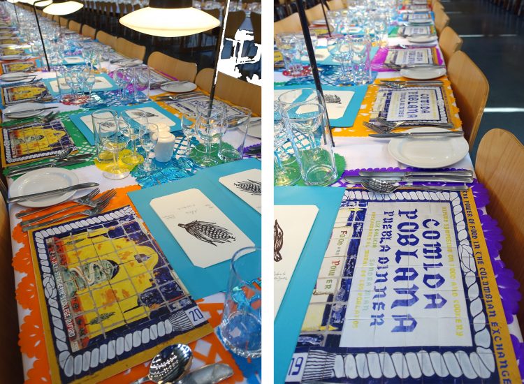
Over the Symposium weekend held at St Catz there are four memorable meals. For the past twelve years to accompany these dinners and lunches I’ve designed menu cards for the long communal tables in the dinning hall. Some become posters, others are elaborately folded or simply tucked under a napkin.
Months before the Symposium I start thinking about the menu cards by folding A3 sheets of paper. There are considerations of quantity, logistics of use, legibility, where it sits in the place setting – alongside a need for pure visual expression. I think of the year’s theme, a subset of a national cuisine or a political back story. Over the years I’ve noticed that the repeated pattern of the cards on the long tables can be utilised or subverted, as in the St John menu in 2016 or With Her Hands in 2019.
When approaching the design I use a triad of language, typography and pattern to evoke a sense of place, a town, a country or a cuisine – sometimes adding photography, illustrations or other graphic elements. The title of the meal prompts initial research. For “The Power of Food in the Columbian Exchange” from a celebrated chef in Puebla I really need to visit Mexico. I’ve long been a fan of Mexican cooking – although my experiences are still rather second hand, from the books of Diana Kennedy, food carts and taquerias in Los Angeles and Palm Desert or from buying Mexican herbs and spices in California. I always bring back a suitcase full of dried chillies (chipotles etc), epazote and even fresh masa.
Over the past few years I’ve visited some of the restaurants which are invited to cook at the Symposium to get visual clues and soak up the ambiance by taking photographs and making notes. These have included: St John, Bocca di Lupo, Le Cafe Anglais, Allegra McEvedy’s Blackfoot, the Hubb Kitchen, and Olia Hercules’ kitchen. When a menu is focussed upon a region, such as Puebla, I do visual research on architecture, design, ceramics, as well as ingredients and cooking. For Puebla this led to searching local museums online such as El Museo de las Constituciones, and in doing so I found myself on Google Earth wandering the streets of Puebla for several hours. The architecture and hand painted shop and restaurant signage reminded me of Havana, Barcelona or Madrid
On 16 de Septiembre Street I found the restaurant El Mural de los Poblanos. The chef there is Liz Galicia, she’ll be travelling to Oxford to cook at the Symposium, an exciting thought. I took a screen shot of the tiles on the neighbouring building, the Palacio Federal (post office). It was whilst virtually strolling through this quarter that I stumbled upon the Mercado La Victoria de Puebla, an old market building whose outer walls contain lines of small shops. Set into the stone fascia above each shop are faded green signs with white lettering, the hand painted type has broad sharp strokes. Over the decades some have been repainted so variations have crept in, although they’d look much the same to most shoppers.
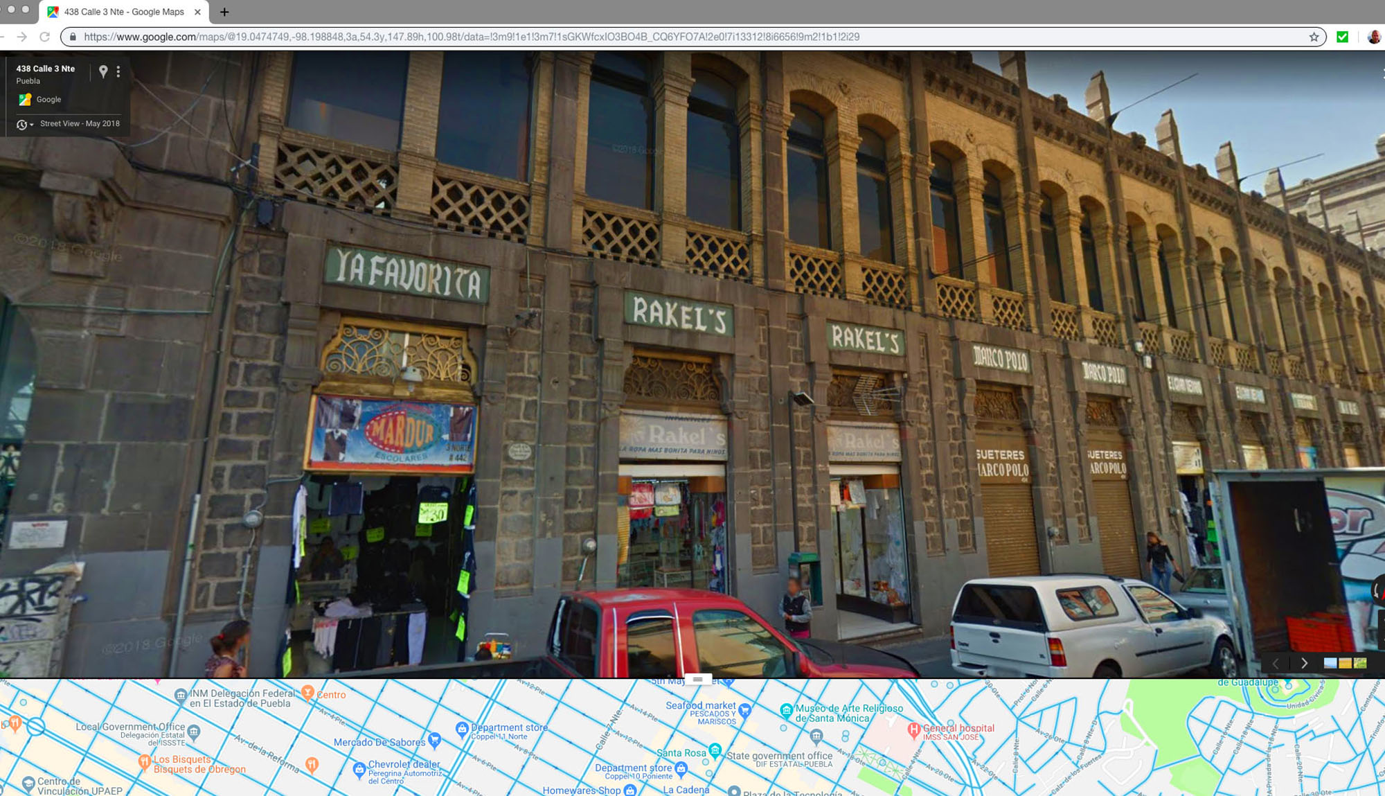
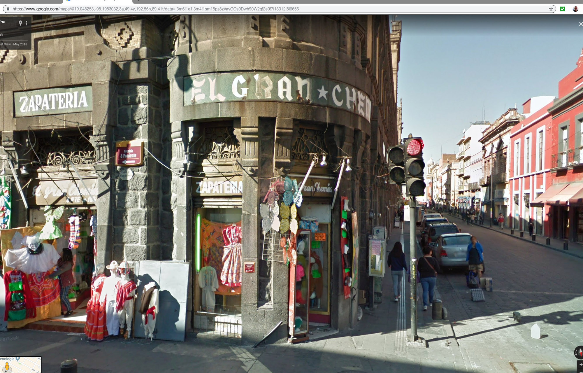
Creating vernacular, urban typefaces from found fragments of lettering is something I’ve being doing for a long time. When visiting Havana I made five typefaces from photographs taken of signage in the city and extended these characters into full alphabets for use in a cookbook. To truly evoke Puebla at the Symposium the market typeface would be perfect. Walking the perimeter of the market building I found fifty signs all baring this characteristic lettering. I photographed (screen-shot) all of them. After converting them to black and white images I chose a selection of characters that worked together but also revealed the glorious disparity and subtle variety of the signage. Using typographic software I designed an entire alphabet based on these signs. With the addition of Open Type coding the typeface would allow certain computer application programmes to automatically add variations – so when typing “ensalada” all the “a’s” would be slightly different, an important touch when creating a typeface that is supposed to look hand painted. I named the typeface Puebla Mercado.
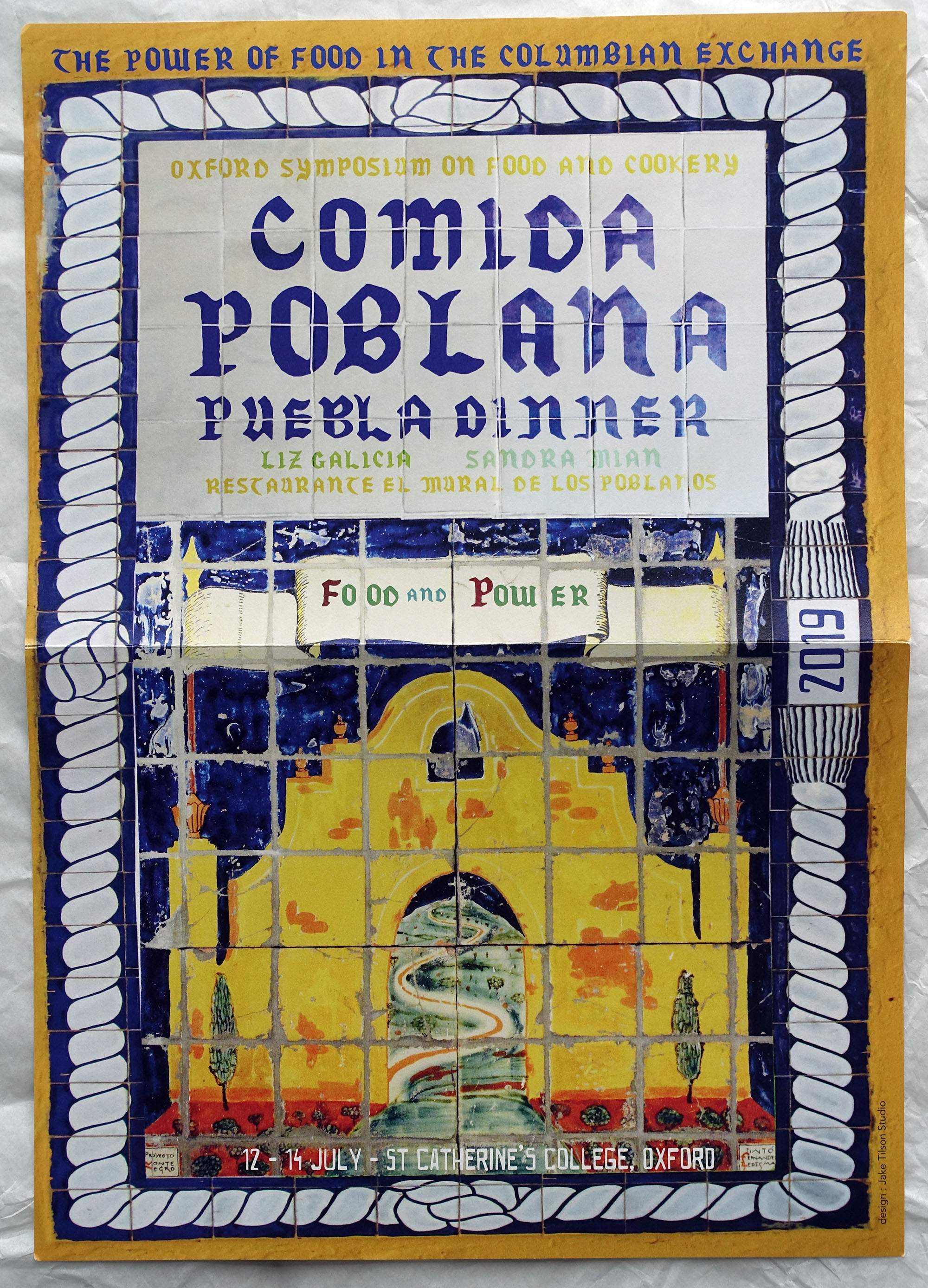
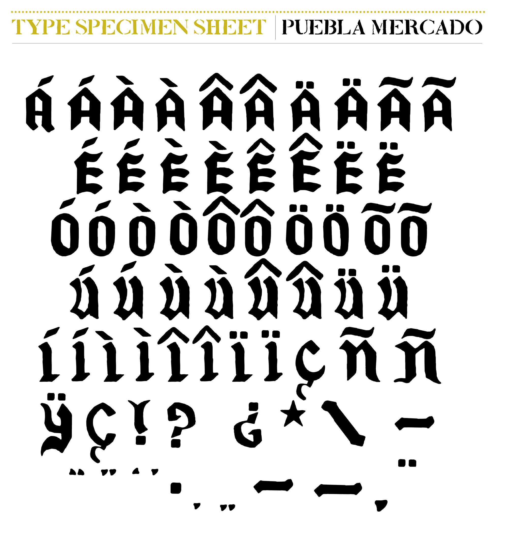
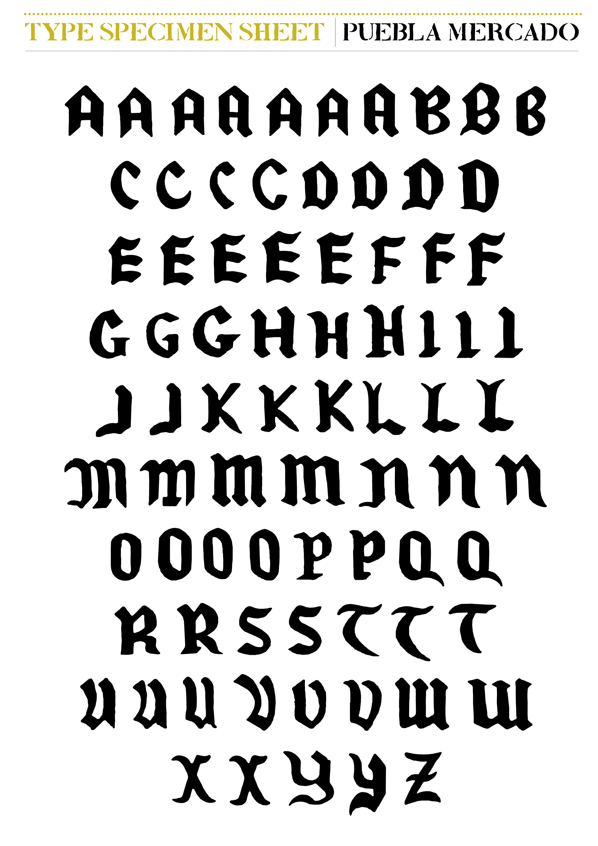
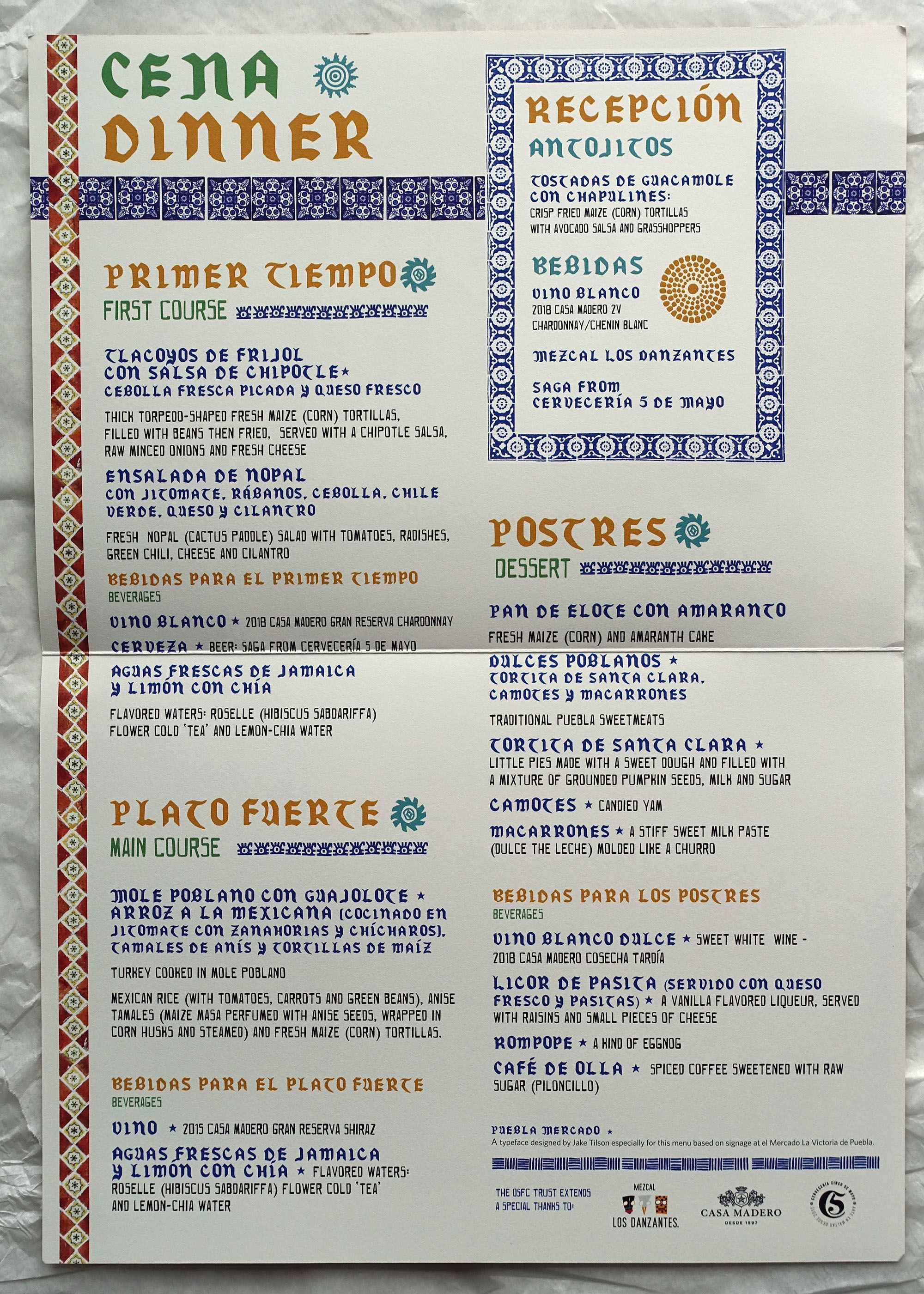
As the origin for Puebla Mercado was large shop signage it worked well for the headline typography on the menu card, for the menu-item descriptions I used one of my Havana inspired typefaces, based on a hand made no-parking sign. The final menu card/poster brought together this typography with the ceramic tiles I’d found online, all knitted together by the poetic names of the dishes and drinks.
When I eventually get to walk the actual streets of Puebla I’ll now know my way around the city and where to get some delicious food.
Buen provecho! Jake
If you’re interested in other slightly wayward ways to make typefaces do have a look at the Fonts section on my website – from Scottish trawlers to theatrical Liverpool.
Devised and organised by Sandra Mian, cooked by Liz Galicia of El Mural de los Poblanos, with Tim Kelsey and the St Catz Kitchen.